I've been preparing a portfolio of my work to show galleries and to include in proposals for future projects. It's the 'Dark Side of My Art' as I like to call it: the administration, promotion, publicity and niggling-iggling bits that must be done, but which are never quite as much fun as the swirly, twirly, and reflective bits I like the best.
As I've been doing this bit of Dark Side work though I've been faced with the particularly challenging issue of how to best capture the sensory experience of a full-size 2-D/3-D objet d'art within the more limited small-scale flat-work nature of a low-res jpeg. This concerns me as sending off word-counted, thumb-nailed proposals via email doesn't give me much space in which to really communicate the magic of my glass work when it's seen in all it's real life, visceral glory.
So, here you are.
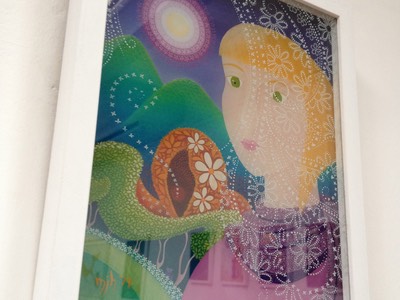
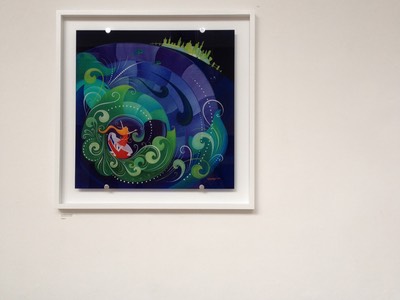
And there the works hang on a gallery wall.
Both of you far from where I sit typing these words.
I'm not entirely sure I can bridge these gaps even in a self-edited blog with all the time in the world, but I'd like to at least try and make you aware of the difference between what you see on your screen and what it is to experience my work in a more fully sensory world.
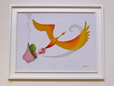
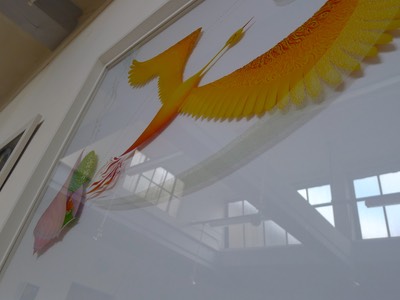
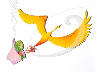
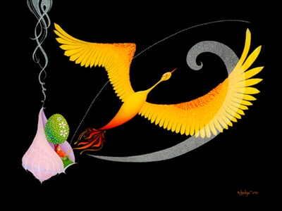
Starting with the clear glass background of the "Phoenix Dreaming" you can see how the painting is lifted by the white stars and luminous colours against the even whiter background. Looking closer and at an angle, you can even catch a glimpse of the shadows cast under a strong light. Which is lovely in real life, but causes no little heartache when you're stood in the photography studio considering how to picture and present it for the fine art print version. As a matter of fact, the photographer rolled his eyes at me when I first suggested it: but don't worry, it takes more than a bit of eye rolling to put me off. In the meantime, we went for guaranteed impact and set the unframed painting against black velvet for the initial snaps. It is, by far, the clearest and crispest of images, and it brings to mind the fabulous Russian lacquer boxes of my study abroad days in St Petersburg and Moscow.
Light and dark - character doppelganger or an accidental expression of ying - yang duality by means of trying to find a technically neat solution to a multi-dimensional problem?
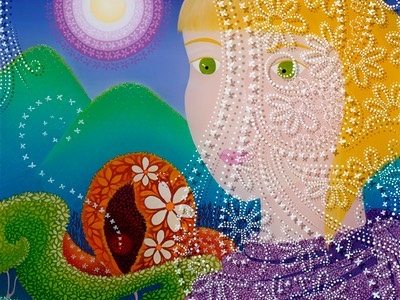
Next up is "Through a Looking Glass" - the two part painting which forms the main publicity image for my exhibition of the same name. Conceived of as a two part painting, this work is comprised of a solid painted background image (featuring the girl, trees, cat, mountains and sky) and a frontispiece of clear glass painted with a lace-like veil. If you look at the 2-D print version you can see how the photographer's strong light and serendipitous skill has captured the shadow of the veil falling across the girl's face and spiralling towards the pupil of her near side eye.
However, if you look at the painting in it's doubled up, original version the veil is less certain and more ephemeral. The shadows are softer as the surrounding light is more diffuse, and the lacy patterns shift and move across her face as you, the viewer, move around the painting.
And that's without even considering the shifting reflections. As is the way with such a glossy, glassy material your eye will sometimes be caught by a flash of reflected light as you pass and then, in a single step, it's gone again so that nothing separates you from the glory of the glowing pigment. Sometimes, too, you will find your own phantom image reflected within the frame and, like Alice, you will see how easy it is to pass through a looking glass and into the adventures beyond.
Last, but not least in turning 2-D paintings into 3-D objects, is the framing of the work itself. The edge that defines where the world ends and the artwork begins - or perhaps the enchanted threshold that keeps the looking glass world locked safely away within it's own borders?
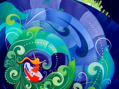
With "Storm in a Teacup" the glass has been painted to it's very limits, so that in the space between the painted surface and the frame a shadow edge of soft blue luminescence falls - recalling ancient light through chapel windows of aquamarine. Counterpointing this timeless light, the chrome stand-offs give a strikingly modern feeling to a painting that tends more towards medieval manuscript illustration than the estate agent's flyer that the stand-off was originally designed to display.
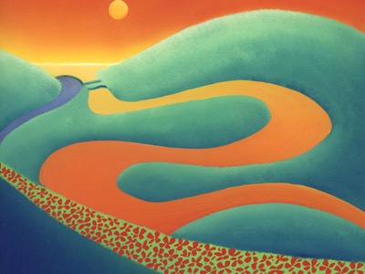
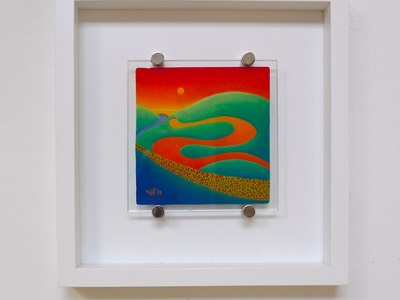
You can see the real architectural impact of this framing style in the last painting featured above: "Cuckmere Meander" from my Sussex series of Looking Glass Landscapes. This series is a collection of small, bijoux paintings in which I have intentionally left the edges of the glass clear so that the medium is impossible to ignore. Here the stand-offs and matte white, contemporary frame almost entirely disappear - leaving you with the feeling that the painted landscape is drifting across your awareness like a half-remembered dream.
Objects of art - art as objects.
Ephemeral experiences that make you stop and look, and look again, encouraging you into a soft and dream-like state despite the hardness and sharpness of the glass and the vibrancy of the colour.
These metaphors now out of my system, I still do not think I have succeeded in capturing the magic physicality of the works themselves in these words. And so, I think the best solution remains for you to come and see the paintings for yourself, in person. The exhibition featuring these paintings remains on display through the 28th of May 2015 at the Conway Hall, Red Lion Square, London - close by Holborn station and only seven minutes walk from the British Museum.
Click here for this week's hours.
Catch them in person before the phoenix has flown.
Recommended entries on this blog for new visitors:
That Alice Girl
Through a Looking Glass - Slideshow
The Making of a Painting
Grounded in the Croatian Naive
The Bonus Content
